BTC Stands for "Behind the Curtain". Its a look at work created by various artists, photographers and creators around the world.
Its a small peak behind the curtain as to how the piece was created and the conceptual ideas behind it.
All art comes with a story.
"Awakening" was a piece of art that went through so many evolution's that I was surprised I ever got to a final version I liked.
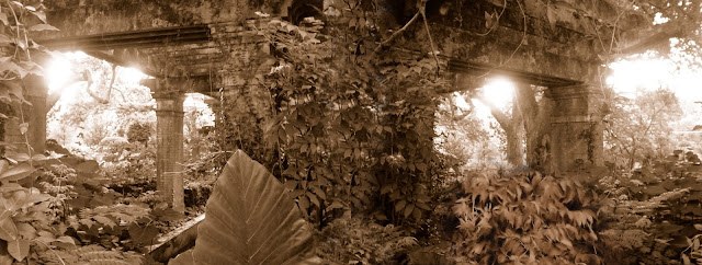
The original piece was based on two very old photos I took when I first came to New Orleans. On St Charles Avenue there was a corner mansion with a large stone wall and gate shut tight. The house at that time was covered in so much greenery that you could barely make it out. It always fascinated me when I would go by it because it seemed so otherworldly.
One day I decided I wanted to see what was on the other side of the stone wall. I had my camera with me. Laying on the side walk was an old tar bucket that someone had left against a telephone pole. So I moved the tar bucket over near the wall and carefully climbed on top of it, giving me about two inches of space above the stone wall to peer in.
To my amazement was a secret garden. It was obvious that no one had cared for it in a very long time. It was overgrown with something that looked like a cement gazebo in the center. I snapped two quick photos right before I fell off the tar bucket, sprawling onto the ground in a heap.
I tried to find the originals in color, but I'm afraid they were lost in a hard drive crash years ago. But I had the sepia toned versions that I had placed in one of my master folders and they were so magical that I still go back and look at them from time to time.
About seven years ago I began working on what would be a series of evolving images using photos from the 1800's and merging them with my own photo work. I'd run across this amazing image taken of a circus performer around 1890.
She was so awesome looking that I knew I had to bring her back to life in a new piece of art. Because of the natural plant life around her in the original photo, I decided to try for a natural setting. This is when I considered using the secret garden images.
Nothing seemed to work that looked right to me. That is when I decided that using one of the garden photos was not enough. That I needed to use elements of both. So I began to merge the two.
By reversing one of the photos I actually was able to recreate the gazebo a bit. It wasn't perfect, but it was a start.
Next I used all my skills to remove the seam point from the middle of the image and make it look like one image.
Not too bad so far. The lineup of the two photos really made it look real except for the fact that there was sunlight filtering from two directions. I'd worry about that later.
Now those giant elephant leaves were throwing off the balance. They had to go.
So far so good. Much more balanced. Now it was time to start to bring in a little color. So I dropped out the sepias went with to very pale gray/green for the base color.
With the color change, all the added pieces of greenery were now one uniform color scheme. Now my next thought was that I needed to add an additional pillar to the center. So I tried this.
This was a visual trick. I'd copied the pillar to the left, reversed it and strengthened the line work a bit so that it looked different enough to not look like a copy. Now I wanted to work with the colors a bit. So the next step was to play with the shadowing and overall line work a bit.
This technique while it may look odd, allowed me to introduce a specific color scheme into the piece. I could now work with the greens better and blend everything in using the purples as a shadow color. Now the leaf work began to perk up.
At this point I noticed a balance problem. The far right pillar had a lot of empty space to its right, where the pillar on the left cut off abruptly with no space to even things out. So here I took the far left side of the image and copied it. I then reversed it and added it back on, creating that much needed negative space that balanced the image.
Now I took the new addition and blended it just enough to make it look real and not like a carbon copy.
Now that there was balance on either side, that pillar I'd added into the middle looked off. I'd placed it to give balance before I added the additional area. As a result the center pillar was now off center. I could have just moved it over, but now I decided I wanted something to frame the tiny lady (remember her? Well get back to her eventually). So I went in search of a door. I found an interesting stone doorway on an image I'd taken years back of a Revolutionary war fort. I removed it from the original image and plopped it down in the center of the garden.
It totally eliminated the center pillar but brought the whole piece back into balance. Perfect! A few last adjustments to the shadows produced this.
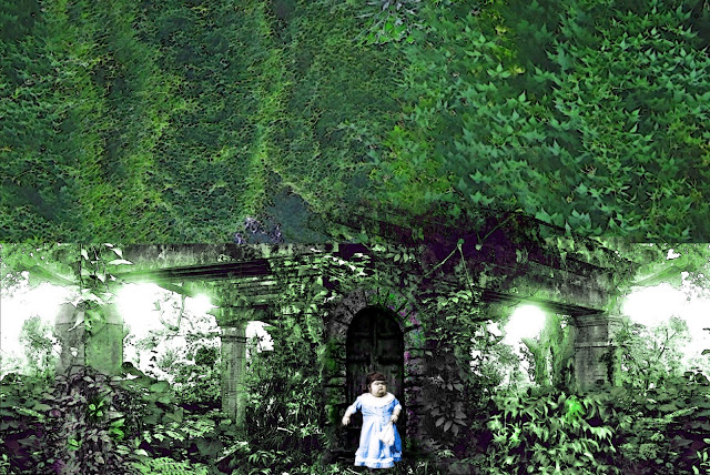
Now it was time to bring the tiny lady back! While the work was being done on the garden, I'd also been dabbling with her original image. I'd brought her back to reality by giving her some color and shadowing. It was now time to bring her into her garden.
And there she was, just like she'd just come out the door on a beautiful spring day. There was one last step (or so I thought). We needed to brighten her colors a bit.
And just like that (many days later) she was complete! The piece was named "Where the Little Folk Dwell" and it was placed in a series called Time Intruding.
5 years later that series which only had about 12 pieces in it, was absorbed into other series. But the little lady was set aside. There was one unfortunate problem with the image. Because it was so long and narrow, it never fit well when I would share it on social media. Parts would get cut off and it never looked as good truncated as it did when seen in its complete form. For all the work I'd done on her, I felt like the limits of technology had sort of gotten in the way.
But of course the little ladies story was not over. As my skills developed I eventually went back into my files and decided to work with her again. Now how could I eliminate the problem with the image being so long without remove key parts of it?
What if I added to the top of the image? I'd done it with adding to the left side, perhaps I could come up with a way to make the image higher rather than longer.
I began with this.
Ugh! That looked terrible! Maybe this idea wouldn't work after all. The gazebo was now cut off in the middle and I had no images of the higher areas of the garden.
Now wait, I had enough of the original gazebo that just maybe I could fudge it enough in the foliage to make it work. I began on the right hand side by cutting out the original roof top and the inverting the piece to make it look like an extension of the original roof into the foliage.
Still looked like crap, but lets see what I could do with the left hand side. I used the same technique for the left but rather than reversing it left to right, this time I reversed it bottom to top.
Alright, that sort of worked. There was structure there now. If I could hide it a bit, maybe it might work. So I added some hanging vines.
So far so good. Lets make the vines look a little more natural while at the same time giving a bit of life to all that upper greenery.
Better, but the hanging vines still looked like they'd been added instead of a part of the mass of green. So I added some more color in the form of what I hoped looked like hanging wisteria. This hid the sharp edge of the added vines and buried them into the greenery and it gave the upper foliage more character.
Now for some more striking colors and shadowing to bring out depth on the underside of the foliage.
Perfect! Suddenly the newer portions matched the older and the gazebo roof was effectively buried and the image was no longer long and narrow. But now there was another problem. That giant canopy of green and purple was pressed down on the rest of the image in a way that just didn't feel right. If the image was about the little lady then she was almost lost beneath the greenery. It was not an effective use of space. There had to be something more.
I played with it for awhile, trying different ideas. Then I realized that what was missing was "awareness". That foliage was alive in more ways than a plant would be. It was aware of what was going on around it and of the little lady below it. The image had shifted to being about the lady to being about the plant. This is where the final idea came into play. I added eyes.
Suddenly the image came alive. My original perception about this being the story of the little lady was no longer true. This was about the garden, as perhaps it was always meant to be about. The eyes created awareness. The space was alive. The Green Man personified.
One last thing was needed.
Those giant grasping green hands gave all that beauty a menacing feeling. There was life here and it wasn't particularly happy. The story was complete.
The final image was renamed "Awakening" as a guide to the viewer and the piece took its place in my portfolio and as one of my favorites.
As you can see, this was no easy piece to create and I've always felt that the back story behind it was almost as interesting as the piece of art itself.


No comments:
Post a Comment