We often take light for granted in art and photography. We do not think about the angles, the shades, the colors, etc. But understanding light angles can be crucial to a great composition.
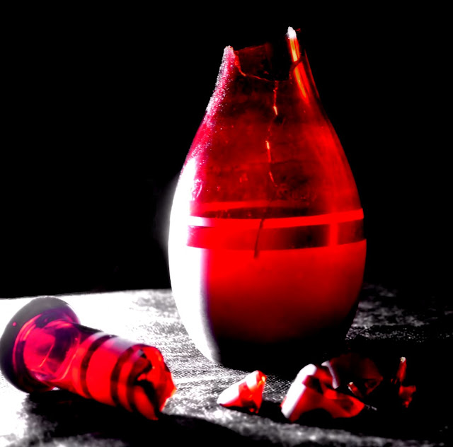
We recently did a light study in the studio. I took a simple broken red glass vase and set it on a pedestal and had my intern Jackson sit in front of it and photograph it over and over again. Each photo was taken with the light at a slightly different angle. The settings on the camera varied between using the flash, not using the flash and using a low light setting.
The light was positioned above, behind, to either side, from underneath. We then used a light source within the vase to create light that radiated out from the red glass.
Now the lesson seems rather simple. But the fact is if the vase were replaced with a human body, the same exact rules would apply. By using the vase it gave the intern a greater insight into how many variations a human body can be photographed. By observing first how the light played on the vase, how the shadows lay around it, how the light reflected, gave a much clearer understanding of the process of light, something that we all need to consider from time to time whether we are artist, photographer, digital artist or sculptor.
I often talk about the importance of imagination in creating pieces of art. But if we can also become conscious of how light plays over surfaces, we can produce better quality art.
I am often asked why I rarely use primary colors in my work. I almost exclusively use metallic or pearlescent tint paints instead. This is because to my eye the reflective qualities of metallics on light make for a much more interesting piece of art. Rarely now do I stray into a primary non-metallic pallet for that very reason.
I think the biggest challenge is staying aware of light. We take it so for granted in everything that we do, that we forget it exists. But if we pay attention to it a whole new world opens up for us as artists.
Also learning to understand how a lack of light effects things is equally as important. We think that less light means a less effective piece of art. Indeed the opposite applies because we are forced to look at the outlines of an object and to see it in a whole new way.
The photo at the top of the page was the first photo taken in the light study. It was taken with light on either side and with the flash on and to show the effects of an overall light source. From there we then varied the light sources. So lets look at some of the angles. Please note these are raw images with no changes made.
This was taken with the light source to the left of the vase and without flash.
This was taken with a left light source centered at the same level as the vase and a right light source centered higher than the vase. Again no flash applied, but you can see the difference in the smoothness and quality of the image.
This was taken on a low light setting on the camera. The lights are positioned exactly as described in the above shot. The whole mood of the piece has changed.
This used a sunset filter on the camera. Again the light sources stay consistent with the photos above.

This final image was taken with the flash, again the lights stay consistent with the above photos.
Here the light position has changed. There is now a single high powered daylight bulb shining down from above. You can see the light pole to the left. This has cast the vase in a completely different way. There is not as much reflection and the glass has become slightly more illuminated.
Here we've added a second light source above. There are now two lights shining directly down on the vase.
Now we've added one more light source coming in from the right and at the same height as the vase.
Now we've switched things up a bit. The light source has been repositioned to be sit only about 10 inches from the vase and at the same level. All other light sources have been removed. We've also turned the vase a bit to show the large crack running down the center of it. With the light source closer, the case takes on a much more luminescent form. This was taken without flash.
Now we've repeated the same photo but taken on low light.
Now the light source is coming in from the right and the photo taken on low light.

Now the light source has been placed directly behind the vase and a bit lower to it. Again the camera was on low light.
Now we've placed a light source within the vase in the form of a small strand of LED white lights. This image used a flash.
This was taken without the flash. The only light source is the strand of LED. No exterior lighting used. I've also rearranged the glass shards a bit.
This was taken on a low light setting on the camera.

The same low light setting but the vase was tipped on its side and the spout leaned again it.
Now pay attention to this image and the next few. The only difference is that I've had Jackson leave a large open area on the left of each image. While its our first instinct to center an object, it can often be more effective to allow for some dead space. Note the shadow of the vase. The light source is to the right and slightly higher. It was taken with flash on.
We've come in a bit closer now to the vase, but kept the left hand dead space. This was taken without flash.
This was done with the low light setting.
Now we've removed the inner light source and put it outside of the vase and removed all other lights. It may seem a little cluttered with the light wires in view, but if you focus just on the light and not the composition you can see how the light reflects into the glass.
Now here the LEDs have been placed behind the vase. Again no other light sources are used and the photo was taken on low light.
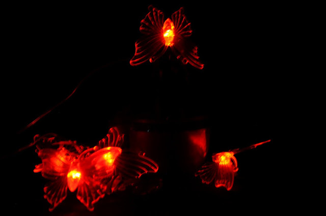
In these last two images, we are using a strand of LED butterflies which change colors. Their was no exterior light source and the photos were taken on low light so the phase almost disappears.
Now lets take a look at some of the final forms that these images can take. Now we are concerning ourselves with the composition and letting the lighting do its work. I am not going to explain each of these images, but take a good look at how many variations were achieved just from the photos shown above.
I'll show the raw image first then the variations from that image.
 |
| Original |
 |
| Original |

 |
| Original |
 |
| Original |
 |
| Original |
 |
| Original |
The amount of variations is infinite and only bounded by your own imagination. Now apply this to the photographing of a body, or objects and what can you achieve by paying attention and varying the light sources?
This concluded the light study. The above images took about 15 minutes to photograph and another 3 hours to create the variations. My thanks to Jackson for photographing and helping to prepare this tutorial.


No comments:
Post a Comment