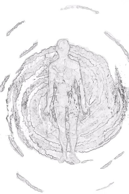
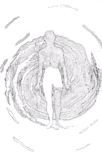
I am intrigued by the recent fascination in the United States with adult coloring books. You walk into a craft or art store now and you see dozens of these for sale.
In the past few years I've suggested to several of my artistic colleagues that this may be the route to go with some of their black and white pen drawings. But I'd never considered rendering some of my own work into pages that could be colored...until now.
I've decided to create a 2016 limited edition coloring book of my work. I have a rendering technique that I've used for creating black and white prints that I considered using for a graphic novel at some point in the future. With a little refinement of the technique I believe I could create quite an interesting coloring book.
Here is an example piece rendered.
I did some experimenting on paper but I wasn't really happy with the quality. So after working up the following piece, I printed it on high quality photo paper and was much happier with the results.
The result of using photo paper instead of regular copy paper is a much more refined coloring experience also. Here is an example of a partially colored piece where I used sharpie markers to see see if I liked the experience.
I must admit I felt a little narcissistic coloring my own work, but at the same time I was sort of getting into it. I guess the child in me loved coloring as much as any artist does. Thats why we are artists.
So I think I've made a decision to put a designer pack together of 12 prints on photo paper that can be colored. They won't be bound, but in a loose leaf folder. They will be limited edition for 2016, each one signed on the back. Not sure on a price point yet. That will take a bit of research. It took me about 2 hours to render the above piece from the original piece of art. Here is the original for comparison.
It takes some care and consideration to adapt the original into something that can be colored but I think the experience alone may be worth the effort.
The one thing I can say is that looking over coloring books offered in the stores for adults that I found most of the pieces to be too simplistic. They were all about straight lines with no guidance for color variations. What I found interesting about the piece rendered above was that it was complex. It challenged me to just in the few minutes I worked with it. With that in mind I will work on producing pieces for the series that are more complex and challenging in nature.
More on this later as I continue working it up. I would appreciate comments from other artists who might be considering doing the same.
UPDATE 06-08-16
I've done some extensive work on adaptation and refining the steps it takes to get from a photograph to a finished piece that can be colored. Its tricky and its all about lines. The hardest step is removing the artists brain from the equation. What I mean by this is that I want to see everything from the artists perspective, which means wanting to keep elements of the piece in place that really need to be removed from in order to make it a good coloring piece. It is essential to remove certain elements from the piece that just serve to clutter rather than to enhance.
If you look at our tree here, the first example was the first attempt shown above. The second is a much cleaner version. Still not as clean as it could be yet, but you can see how I've removed certain elements of the clouds that really become too abstract once rendered down to line work.
Its a slow process of removal and sometimes its essential to not remove an element but to lighten it considerably. As you can see here, I've lightened a lot of the branch work and some of the hanging moss to make it easier to fill in.
But part of the process is in choosing a photo that has the proper elements to go through the rendering process without losing a large amount of it. In the case of this tree if I was working on a scale of 1 being the best choice and 5 the worst choice, I'd give this tree a 3. But that comes with further experience.
In the meantime I've begun a new project called The Book of Man which will be a fine art coloring book of the male form. I am convinced that "fine art" is part of the key to this. If it looks like an Archie cartoon then there is no art to it. So finding the balance will be the most challenging. Here are a few examples of the current work. These pieces have gone through two levels of cleanup. The first was the initial rendering to line work. The second was a fine tuning. They will go through a third cleanup before they are chosen for the final pieces for the book.
You'll note that I've watermarked these examples because its simply too easy to just print them off on a computer without ever buying the actual coloring book.
UPDATE 06-08-16 (2)
I had an interesting comment from an artist after I posted the updates to this page. Knowing that the work I am experimenting with all originated as photography work I'd done, the artist wanted to know if the same rendering process could be used to convert works of art in the same way. So I pulled up a piece of art and began the rendering process on it. I admit its tricky but its not impossible. I purposely chose a rather difficult piece for the experiment. In a way its like a brain puzzle. How can I remove and enhance portions of the piece so that the essence of it remains but the confusing areas are removed. Again the artists mind kicks in where I want to try and save portions that are rendered rather useless by the conversion process.
It is very easy to mess up. If you let your attention stray, you can easily wipe out a feature that should have remained in place. It is helpful to keep a photo of the original piece of art nearby as reference. I imagine this is much what a color blind person experiences when driving down a road at night, where everything they see is either glaring light or utter blackness. Color gives us reference points to what we are looking at.
Here are the current example in its various forms. When I complete it I will add the final image.
I'll update this page with more tips and ideas for the rendering process and of course more examples.
~Grey~


No comments:
Post a Comment