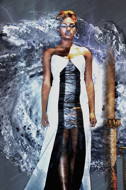
If you've not read Part 1-The Land, I suggest you read it first as I will not be going back over things discussed there for this series.
When I originally conceived the Katrina Portraits back in 2015 it was not with the idea of creating ground breaking art, but with the idea that I wanted to reflect how the storm literally pressed down upon the inhabitants of New Orleans. Originally the series was just supposed to be about the faces, or lack of faces and how the storm made us all equal to its devastation. The rich, the poor, the performers, and the factory workers all faced the same problems.
It was later that I decided to add the Land portion of the series. New Orleans takes its landmarks seriously. The places that make these people as just as an important part of them as a family member would be. It would not have been right to exclude them.
In the reimagined Land series I found that creating new versions of the older work was relatively straight forward. When it came to the Faces, I found it was not nearly as easy. I worked through a number of ideas such as the reimagined piece from 2015.
Nothing seemed to work. So I tried a different direction.
After a few days of playing with different concepts I decided that it was the size of the storm that was presenting the problem. In the old series. In the old series due to limited skills, I used the swirl to represent the storm. Now I was using a real storm and it looked small and out of place. The perspective worked in the Land series because the proportions were different. But not for this. So I changed my tactics completely. I chose a different set of people portraits I'd taken over the years and I applied a much large storm to encompass the photo.
Now, rather than the figure dwarfing the storm, or the storm obscuring the figure, suddenly, she was emerging from the storm, There was a symbiotic relationship between the two.
This is important. Perspective is crucial. But so is the messaging. The message was now, of a figure trying to go about their lives with the presence of the storm looming over them.
Now with all that said, there is one more aspect of these images I want to make note of. That is the names being chosen for each piece. Many have noticed the Hurricane Glyph which now sits at the top of this and every page on the website. Over time there will be a whole series of these glyph's spread around the website. Each glyph represents a different emotion found during a major hurricane. And each image in this series will carry the name of one of those emotions.
So with that I set about finding the images taken of locals over the years that matched the concept. I've attached the original photo along with the final work and a little about each original photo since I think its important that there be some context to the images used. Click any of the images below to see their page.
MORE TO COME. CHECK BACK SOON!
For those interested, I've also posted the original Faces portraits from 2015 for those who would like to see where the concept originated.


No comments:
Post a Comment